Let me tell you a story...
Telynet S.A. was founded on 1st June 1989 with two employees, 500,000 pesetas [3,000 euros] and several partners from the economic and business sector.
Back when paper replacement software was considered science fiction.
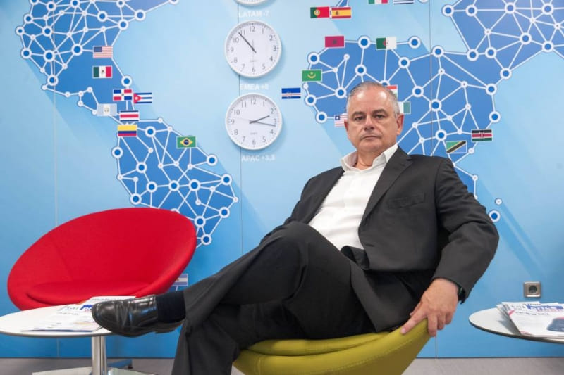
In an interview with Enrique Bermúdez Rabal, CTO and one of TelyNET’s founders, the only one who remains today, he told us that he was the one with a background in computer technology, and that there was an abysmal difference in age between the partners:
“I was the youngest at 24; the rest were on average 16 years older than me”.
He also stated:
“We worked with an Italian company that made hardware and gave the software away for free, and we thought this was where the potential lay.”

Telynet’s team of professionals works to be an extension of the customer’s own company and to be able to develop the appropriate digitisation for each business, always using the latest technologies.
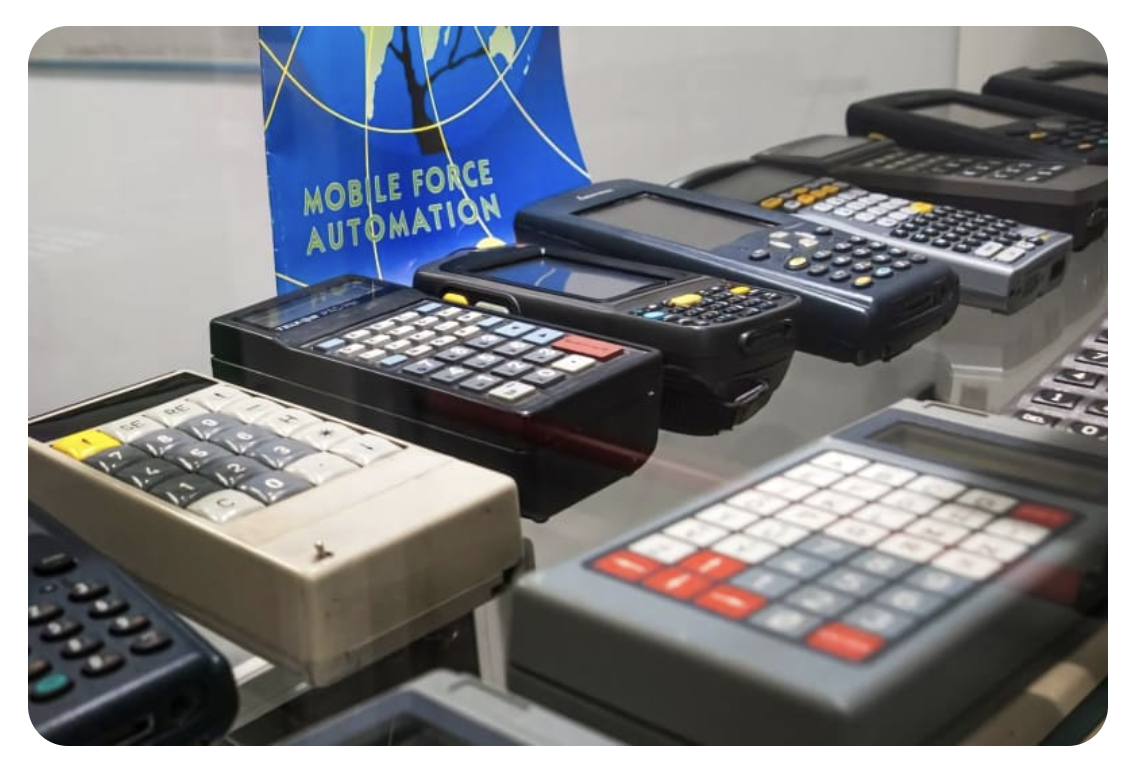
A radical change took place in the market in 2001, with the launch of the first version of Windows Mobile by Microsoft.
Enrique Bermúdez stated:
“That was when the enterprise mobility business really took off; they realised that working with paper was a backlog and that they needed to automate their sales force,” the CTO pointed out.

The customers grew with us and we created a Long-Term Business Relationship.
We grow by training, researching, listening….
This brings us to the current changing markets that require our B2B customers to be more present than ever in Digitisation.
Because the rebranding of the logo...
We want to present TELYNET to the world as a fresh and renewed image, which represents all the values and solidity that experience has given us.
The use of the bonsai tree, which represents the roots of the company and the development it has undergone over time, is maintained.
Bonsai trees are typically planted in a pot, they are trees that can be easily moved from one place to another. Under the right conditions and with the right care they live for many years. The bonsai’s objective is to create a realistic portion of nature, in which the degree of beauty depends on the care of the grower; just like Telynet who creates a realistic portion of the market, studies it, optimises it, cultivates it and adapts it to the customer so that we both obtain a long-lasting and successful working relationship, like harvest. For the ancient Taoist monks, the bonsai was a symbol of eternity, it was the connection between the divine and the human, it was the bridge between heaven and earth. Only a few had the privilege of possessing it and eternity was only achieved by those who managed to keep their bonsai healthy.

Telynet has services and products that are suitable for those who appreciate them. It is the perfect union between the human and the technological, between the tangible, concrete earth and the metaverse, and that is where its greatest strength lies.
When redesigning the corporate image, we think of a logo where the number of inks is optimised and it becomes a simpler figure visually, with lower production costs, always seeking sustainability, while achieving a greater visual impact. By reducing the colours used, we achieve greater focus on the whole image.
The suggested colours are black or dark grey and yellow. Black represents the company’s solidity, the experience and authority it has acquired over the years all over the world, giving companies the confidence to put projects in our hands; while yellow conveys all the vitality and dynamism that the modern era demands in the solutions we provide.
In business, the colour yellow signifies intelligence, originality, dynamism, wealth and abundance. It is a cheerful and vibrant colour, associated with light and brightness. It reflects the friendliness and warmth that Telynet values when it comes to customer service.
From a scientific point of view, bright yellow influences the logical part of the brain, facilitating learning, creativity and concentration. It influences the intellect, providing clarity and confidence. It also represents loyalty and honour.
The combination of black/grey + yellow is used all over the world to highlight advertisements, so it is a combination that captures the attention of our interlocutors.

It is also worth mentioning that these shades were selected by Pantone in 2021 as a symbol of resilience after the pandemic.
This new image is intended to show a renewed face of the company that is always at the forefront, the human side and the technological side working hand in hand. Basis of success for any business. All the elements present in the logo work in perfect harmony, offering their best qualities to achieve a striking and modern image; as does the Telynet team, working with their best technical and human skills to serve the customer who places their trust in us.
We hope you like our new image!!!!
